How does the Commitment of Traders help?
|11th January 2015|
We get asked that question a lot here @MMC so exactly how does the Commitments of Traders have such a big impact? Well to help illustrate I would like to show you what impact the traders recorded within the COT report have on the market and how you can then use this information.
The COT report has traditionally consisted of three groups and would report the futures positions held by traders in each group. These three groups are, Commercials, Non Commercial’s and Non Reportable’s. In 2009 the CFTC made a number of changes to these groups, essentially subdividing them into five groups instead of the three above. The report however is available each week in both formats. I still use the traditional data because of the depth of historical data we can use when compared to just the few years of the new format.
Regardless which format you use you will still keep a close eye on each group but you will align yourself with one of the groups depending on your trading style (long term vs short term). I personally focus on the activities of the Commercials as they historically have indicated the end of trends and beginning of the new trends, which typically last for many weeks if not months. When this happens I will therefore stop looking for ways to enter the current trend and instead look at ways to enter the new trend in the opposite direction.
Using the data released each week our system will then produce a number of graphs from the data to make it more visual and much easier to understand. One of the graphs is referred to as the ‘COT Index’ and this shows us very quickly how much buying or selling the Commercials are doing. A rising blue line (chart below) indicates they are buying more than they are selling and a declining line indicates they are selling more than they are buying, giving a percentage figure from 0 – 100. Trends end when there is an extreme imbalance in the market between buyers and sellers and this index shows us that there is an extreme imbalance when the line reaches 100 or 0. (A reading above 80 or below 20 are actually used by many traders around the world to indicate imbalances, but I will focus on 0 and 100 for this explanation.)
The below chart is of GBPUSD with its 36 month COT Index plotted underneath. You can see that every time the blue line reaches the 100% line or the 0% line there is a major reversal in GBPUSD (marked by vertical red lines).
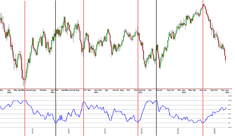
Using the most recent reversal in July 2014 as an example. During a market rally the Commercials will begin to increase their selling in that market. At the point in which they believe that market is ‘over valued’ their selling will reach an extreme and this is indicated on the Index by the blue line hitting 100%. This extreme imbalance then often triggers a major reversal and a complete change in trend, this is exactly what happened in July. I have also marked the two times on the chart using vertical black lines where the reversal was delayed by the Non-Commercials trying to extend the current trend (this group always trades in the direction of the current trend), note also that the reversals did happen eventually.
In short that’s how the Commitments of Traders helps my trading. Having access to this information tells me what every other trader around the world is doing. From that I can make a much more informed decision on the markets I want to trade and I don’t feel like I am in complete isolation sitting in my office.
By Ray Gilmour