Learning to read a price chart is a skill much like learning a new language. You know the chart is telling you something but if you translate a section wrong or only know certain ‘words’ or ‘phrases’ then you will inevitably keep making mistakes.
In the many years I have been trading I have seen one very common mistake new traders make when it comes to reading charts. The problem is traders focus on individual bars/candles and don’t pay enough attention to the
conditions or context in which they have occurred. What this means is that traders will base their decisions 100% on the shape, size or even colour of the current bar/candle and more specifically, on certain types of candles that are
familiar to them. Unfortunately, by doing this you will always be reacting to what is happening and the market will always catch you by surprise as you wait for that next price action pattern you recognise. It’s like picking up a book and going straight to chapter 9, you’ll never really get to grips with what’s going on.
Let’s have a look at a couple of examples.
Figure 1, below is a recent daily chart of GBPUSD. The candle highlighted in the yellow box is what I am referring to. This is the exactly the kind of price action that catches traders by surprise and leads to questions such as
‘why did it suddenly go up’? The candle highlighted is known as a bullish engulfing candle and in isolation it looks out of character with the bars around it as price had been going down, but look closer. Starting with bar 1, we can see a big bearish continuation bar meaning sellers are in control and we would expect price to continue lower.
However, after this big statement was made by sellers we immediately start to see sellers question this decision in
bars 2 and
3. We still finished down on these days but only just, as price swung from positive and negative during these sessions. Not a healthy sign for a down trend so soon into a move.
Bars 4, 5 and
7 are particularly interesting. All three candles are very different but have one thing in common, all three experienced strong periods of buying during their formation, which is evident by the
wicks on each of them. Combine this with the indecision sellers had earlier in the move and the
undersized nature of all the seller candles following candle 1 and this tells us that the move down was done on weak selling which is likely to run out very soon.
When we run out of sellers, buying is inevitable as we see sellers head for the hills, regretting their earlier decision.
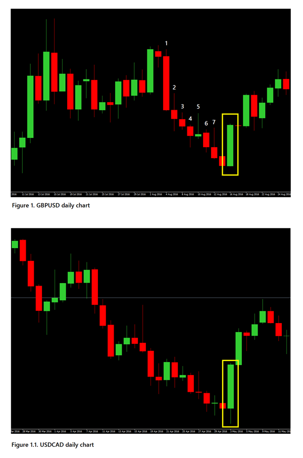 Figure 1.1
, Is another example, this time a daily chart of USDCAD. I haven’t numbered this image as I want you to examine it for yourself but again notice the difference between the
full bodied bearish continuation candles at the beginning of the move down and the undersized, indecisiveness of the candles the older the move becomes. The 9 candles leading into the bar highlighted show no decisiveness or more importantly dominance by either sellers or buyers, but as this is a down trend it is the job of the
sellers to keep up momentum. Again the wicks on many of the candles show buyers are present and are just waiting for the right opportunity to take control.
Conclusion.
In both examples here it was clear that a big swing in favour of buyers was never far away, and your ability to see this kind of price action as it builds will help keep you safe and on the right side of the market. Always remember that Price action is a story and not a single chapter. We need the context of the earlier ‘chapters’ to help see where this story is headed. Take your time to read the whole story, including the bits that might appear ‘boring’, as they will simply make the exciting bits even better.
|By Ray Gilmour|